Within the Impact Vizor (IV) team at HighWire, we work with editorial teams at reputed journal publishers to help them understand the impact and the reach of the scholarly content they publish. IV provides metrics needed to assess and determine the popularity of published content, and validate their editorial decisions for rejected papers. While IV is a tool meant for editors (and editorial teams alone!), we realized that there was a gap in this editorial review process where there was no available data to help editors make decisions. For this reason, we introduce Journal Transfer Patterns.
It is typical of the editor of a journal (Journal 1) within a large or mid-sized publisher (>6 journals) to refer a submitted manuscript to another journal (Journal 2) within the same publisher after peer review. Often, this is due to reasons of scope: the editor of Journal 1 may feel it is more suitable for Journal 2. Editors in Journal 2 may either request the author of the manuscript to revise and resubmit, or may accept it, or may even refer it to another journal within the publication (Journal 3). The following schematic puts this process into perspective.
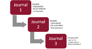
The above schematic can be considered a Journal Transfer Pattern, and for publishers who receive a high volume of manuscript submissions every year, several hundred manuscripts may follow this transfer pattern. We can consider another Journal Transfer Pattern where an external publisher may be the eventual publisher of the manuscript.
The above patterns are a two-level Journal transfer pattern (we consider the number of journals where the manuscript was rejected to determine the levels and not the journal where it was eventually published). An analogy explains it better: Journal Transfer Patterns can be considered to be train journeys, with the journal links/levels corresponding to each halt, the manuscript count corresponding to the passengers taking the journey, and the average flow period representing the time of journey.
To help you visualize this capability further, we discuss some of the common questions our team have fielded when sharing the Journal Transfer Patterns workbook with members of the community.
How does Journal Transfer Pattern reporting help editorial teams?
Like all Impact Vizor dashboards (or workbooks), the Journal Transfer Pattern workbook comes with a combination of filters to slice and dice the data. We discuss the most common use cases here.
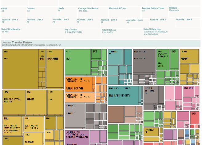
What are the common journal transfer patterns based on a count of manuscripts?
Each colored box is a transfer pattern. The size of the box is proportional to the chosen Measure. (The Measure can be Manuscript Count, Total Citations, Avg. Citations, Total Mendeley Saves or Avg. Mendeley Saves)
E.g. – If the chosen Measure is manuscript, the largest box will contain the transfer pattern having highest number of manuscripts respectively.
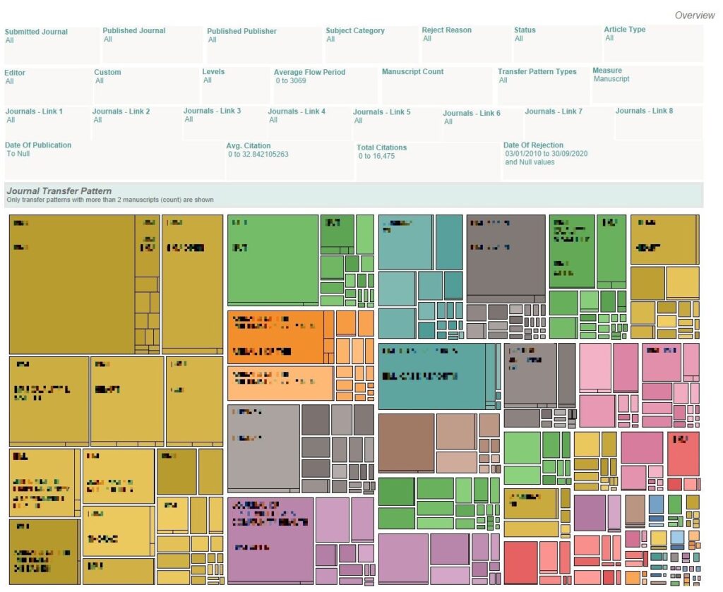
Note: Sensitive information has been redacted.
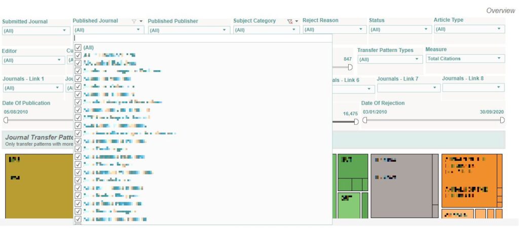
For a given publisher’s journal (where the manuscripts are eventually published), what are the common journal transfer patterns?
From the Published Journal filter, choose the appropriate journal. The Journal Transfer Pattern workbook will now display the common transfer patterns which contribute manuscripts to this publisher journal (can be a journal published by an external publisher).
As an editor, I want to determine the most common journal transfer patterns based on the entry point, or where the manuscript was first submitted.
From the Journal Link-1 filter, choose the appropriate journal, Journal X. The Journal Transfer Pattern workbook will now display the common transfer patterns where the first journal in the link is Journal X.
As an editor, I do not only want to know the common journal transfer patterns based on the number of manuscripts but also want to know the common transfer patterns based on the total number of citations.
Change the Measure filter to Total Citations. The largest colored box will now show the transfer patterns with the highest total number of citations. 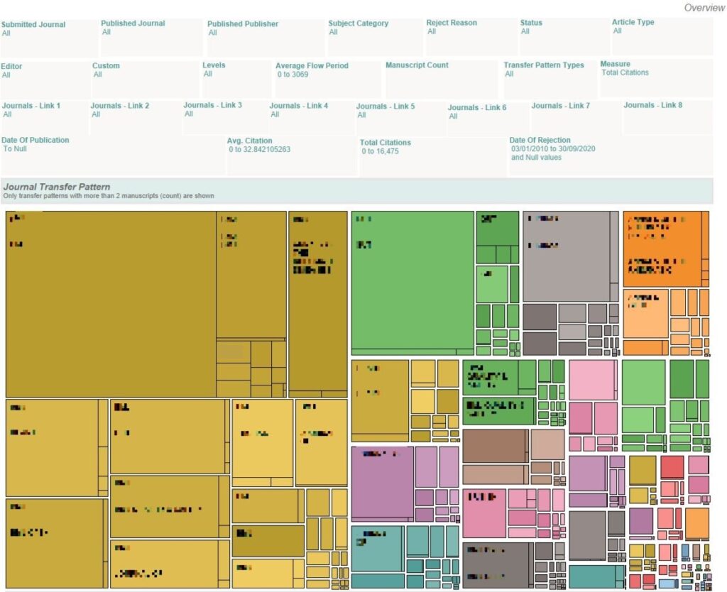
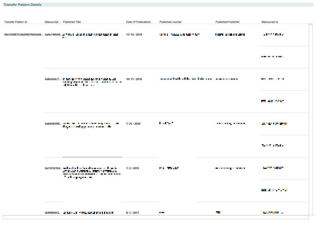
Hold on! You showed me the common patterns based on manuscript count, and citations to date. Can I view the manuscripts underlying a transfer pattern?
You can, of course. To achieve this, click on one of the patterns (the colored box) and it will display all the manuscripts following this pattern. You can see the manuscript title, and, if published, the published journal name, the published publisher, and the published title. The dates of rejection at various journal links are also provided along with the date of publication.
While the journal transfer patterns workbook help me identify the most common transfer patterns within my publication, it does not tell anything about how the common transfer patterns have changed across time.
You can use the Transfer Comparator to understand how the transfer patterns have changed across time.
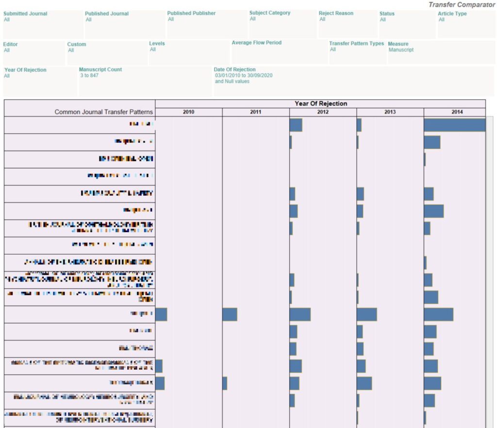
By default, the transfer patterns are arranged for the most recent year of rejection in descending order. The default Measure is Manuscript, implying that the transfer patterns are sorted in order of the count of the rejected manuscripts.
How does Journal Transfer Pattern reporting work?
We work with manuscript submission systems to access the submitted manuscript data for publishers. Using our patented Rejected Article Matching algorithm, we look for published versions of the rejected manuscripts. The manuscripts are grouped together based not only on their published title (if the manuscripts end up getting published) or based on the manuscripts’ similarity if the manuscript is not published in any journal. The similarity is determined from a combination of the manuscript’s metadata.
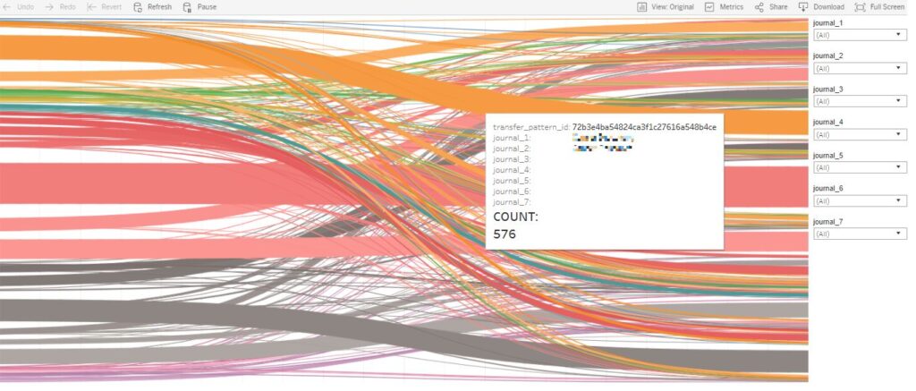
Are there other ways to visualize the transfer patterns?
We are pretty sure that there are, and we are happy to hear feedback from users on the visualizations. One of our initial graphs for visualizations ended in a thud – a spectacular failure! We experimented with the Sankey chart, a visualization of flow patterns using pipes, but found that we could not incorporate as many filters as we would like to slice and dice the data to the maximum extent.
Okay, I am interested in a pilot. How can I try this out?
You can try out IV by contacting info@highwirepress.com to arrange for a demonstration and pilot.
Satam Choudhury is the Product Manager for Vizors, MPS Insight and ScholarlyStats at HighWire and MPS. A former SAP Basis administrator in a premier upstream O&G company, he completed his PGDM in Marketing from the Indian School of Business in 2020. Working as an intern for a leading educational NGO in India, he suggested improvements in the algorithms for screening 15,000 candidates every year. He works with his team to exploit data to provide meaningful insights that help editorial teams, and sales and marketing teams at publishers and libraries.